 站长资源
站长资源
完整代码:
<!doctype html>
<html>
<head>
<meta charset="utf-8">
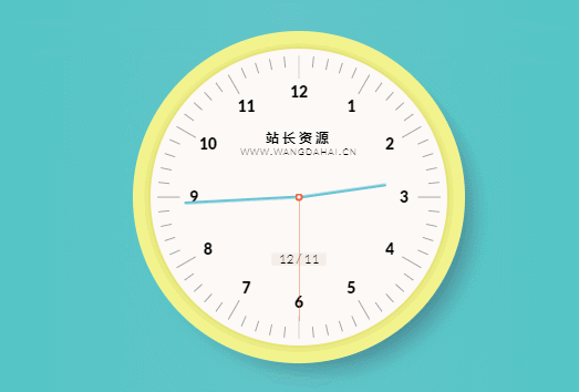
<title>网页版时钟动画效果</title>
<style>
@import url(https://fonts.googleapis.com/css?family=Lato:300,900);
body {
font-family: 'Lato', sans-serif;
}
/* ∞∞ global ∞∞ */
* {
position: relative;
margin: 0;
padding: 0;
box-sizing: border-box;
border-color: inherit;
}
body {
width: 100vw;
height: 100vh;
overflow-x: hidden;
overflow-y: scroll;
font-size: 100%;
font-style: normal;
font-weight: 300;
line-height: 1;
margin: 0;
padding: 0;
}
/* ∞∞ text styling ∞∞ */
h1, h2, h3, h4, h5, h6, p, em, a, b, strong {
font-style: normal;
font-weight: 300;
}
strong {
font-size: 1.15em;
}
small {
font-size: .85em;
}
ul,
ol,
menu {
list-style: none;
}
sub,
sup {
font-size: .75em;
line-height: 0;
position: relative;
vertical-align: baseline;
}
sup {
top: -0.5em;
}
sub {
bottom: -0.25em;
}
code,
kbd,
pre,
samp {
font-family: monospace, monospace;
font-size: 1em;
}
abbr[title] {
border-bottom: 1px dotted;
}
dfn {
font-style: italic;
}
/* ∞∞ form elements ∞∞ */
button,
input,
optgroup,
select,
textarea {
color: inherit;
font: inherit;
margin: 0;
background: transparent;
outline: none;
border: none;
border-radius: 0;
-webkit-appearance: none;
-moz-appearance: none;
appearance: none;
}
button,
select {
text-transform: none;
cursor: pointer;
}
button[disabled],
html input[disabled] {
cursor: default;
}
fieldset {
border: none;
margin: 0;
padding: 0;
min-width: 0;
}
textarea {
resize: none;
}
/* ∞∞ link styling ∞∞ */
a {
display: inline;
text-decoration: none;
color: inherit;
cursor: pointer;
}
a:active,
a:hover {
outline: 0;
}
/* a::before {
width: 100%;
height: .2rem;
position: absolute;
bottom: 0;
left: 0;
background-color: #7ac;
}
a:hover::before {
background-color: #49e;
height: .35rem;
} */
/* ∞∞ hr using box ∞∞ */
hr {
border: none;
box-sizing: border-box;
height: .075rem;
}
/* ∞∞ hidden ∞∞ */
[hidden],
template {
display: none;
}
/* ∞∞ media specific ∞∞ */
audio:not([controls]) {
display: none;
height: 0;
}
/* ∞∞ tables ∞∞ */
table {
border-collapse: collapse;
border-spacing: 0;
border: none;
}
td,
th {
margin: 0;
padding: 0;
font-weight: inherit;
text-align: inherit;
}
/*====================================================== ∞∞ browser specific ∞∞ */
/* ∞∞ IE ∞∞ */
article,
aside,
details,
figcaption,
figure,
footer,
header,
main,
menu,
nav,
section,
summary {
display: block;
}
audio,
canvas,
progress,
video {
display: inline-block;
vertical-align: baseline;
}
a {
background-color: transparent;
}
button {
overflow: visible;
}
html {
-ms-text-size-adjust: 100%;
}
img {
border: none;
}
input[type="checkbox"],
input[type="radio"] {
box-sizing: border-box;
padding: 0;
}
legend {
border: none;
padding: 0;
}
mark {
background: #ff0;
color: #000;
}
svg:not(:root) {
overflow: hidden;
}
textarea {
overflow: auto;
}
/* ∞∞ moz ∞∞ */
body {
-moz-osx-font-smoothing: grayscale;
}
button::-moz-focus-inner,
input::-moz-focus-inner {
border: none;
padding: 0;
}
input {
line-height: normal;
}
/* ∞∞ webkit ∞∞ */
* {
-webkit-margin-before: 0;
-webkit-margin-after: 0;
}
html {
-webkit-text-size-adjust: 100%;
}
body {
-webkit-font-smoothing: antialiased !important;
}
blockquote {
-webkit-margin-before: 0;
-webkit-margin-after: 0;
-webkit-margin-start: 0;
-webkit-margin-end: 0;
}
fieldset {
-webkit-margin-start: 0;
-webkit-margin-end: 0;
-webkit-padding-before: 0;
-webkit-padding-start: 0;
-webkit-padding-end: 0;
-webkit-padding-after: 0;
}
input[type=number]::-webkit-inner-spin-button,
input[type=number]::-webkit-outer-spin-button {
-webkit-appearance: none;
margin: 0;
height: auto;
}
input[type="search"] {
-webkit-appearance: textfield;
}
input[type="search"]::-webkit-search-cancel-button,
input[type="search"]::-webkit-search-decoration,
progress {
-webkit-appearance: none;
}
body{background: -webkit-linear-gradient(180deg, #2FC5BA, #62C6C9, #2FC5BA);background: linear-gradient(-90deg, #2FC5BA, #62C6C9, #2FC5BA)}
i {
font-style: normal;
font-weight: bold;
font-size: 14px;
}
h2, h3 {
font-size: 7px;
letter-spacing: 1px;
font-variant: small-caps;
position: absolute;
left: 50%;
top: 32%;
-webkit-transform: translateX(-50%);
transform: translateX(-50%);
}
h2 {
font-size: 8px;
top: 28%;
letter-spacing: 3px;
font-weight: bold;
}
.date {
font-size: 8px;
width: 50px;
height: 12px;
background-color: #F6EEE8;
border-radius: 2px;
text-align: center;
position: absolute;
left: 50%;
bottom: 27%;
-webkit-transform: translateX(-50%);
transform: translateX(-50%);
}
section.border-clock {
background-color: #EBEB83;
width: 300px;
height: 300px;
border: 10px solid #F4F48E;
border-radius: 100%;
position: absolute;
top: 50%;
left: 50%;
-webkit-transform: translate(-50%, -50%);
transform: translate(-50%, -50%);
box-shadow: 15px 15px 35px -10px #488893;
}
section.clock {
width: 272px;
height: 272px;
background-color: #FDFAF7;
border: 2px solid #E5E375;
border-radius: 100%;
position: absolute;
left: 50%;
top: 50%;
-webkit-transform: translate(-50%, -50%);
transform: translate(-50%, -50%);
}
section.clock div.minutes, section.clock div.hours, section.clock div.seconds {
width: 1px;
height: 1px;
position: absolute;
left: 50%;
top: 50%;
-webkit-transform: translate(-50%, -50%);
transform: translate(-50%, -50%);
-webkit-transform-origin: 50% 0;
transform-origin: 50% 0;
}
section.clock div.minutes {
-webkit-transition: -webkit-transform 1s linear;
transition: -webkit-transform 1s linear;
transition: transform 1s linear;
transition: transform 1s linear, -webkit-transform 1s linear
}
section.clock div.seconds::before, section.clock div.minutes::before, section.clock div.hours::before {
content: "";
position: absolute;
bottom: 50%;
left: 50%;
-webkit-transform-origin: 50% 0;
transform-origin: 50% 0;
-webkit-transform: translateX(-50%);
transform: translateX(-50%);
}
section.clock div.seconds::before {
width: 1px;
height: 113px;
background-color: #EB6444;
}
section.clock div.minutes::before {
width: 3px;
height: 105px;
background-color: #68C3D4;
border-radius: 3px;
}
section.clock div.hours::before {
width: 3px;
height: 80px;
background-color: #68C3D4;
border-radius: 3px;
}
section.clock .cercle {
width: 7px;
height: 7px;
background-color: #FDFAF7;
border: 2px solid #EB6444;
border-radius: 100%;
position: absolute;
top: 50%;
left: 50%;
-webkit-transform: translate(-50%, -50%);
transform: translate(-50%, -50%);
}
section.clock span {
display: block;
width: 1px;
height: 95%;
position: absolute;
top: 50%;
left: 50%;
}
section.clock span::after {
content: "";
background-color: #A0A1A4;
position: absolute;
width: 100%;
height: 10px;
top: 0;
left: 0;
}
section.clock span::before {
content: "";
background-color: #A0A1A4;
position: absolute;
width: 100%;
height: 10px;
bottom: 0;
left: 0;
}
section.clock span.fives::after,
section.clock span.fives::before {
height: 20px
}
section.clock ul {
height: 38%;
width: 0;
position: absolute;
bottom: 50%;
left: 50%;
}
section.clock ul li {
height: 100%;
position: absolute;
top: 0;
left: 0;
-webkit-transform-origin: 50% 100%;
transform-origin: 50% 100%;
}
section.clock ul li i {
position: absolute;
top: 0;
left: 50%;
-webkit-transform: translateX(-50%);
transform: translateX(-50%);
}
section.clock ul li:nth-child(2) {
-webkit-transform: rotate(30deg);
transform: rotate(30deg);
}
section.clock ul li:nth-child(2) i {
-webkit-transform: translateX(-50%) rotate(-30deg);
transform: translateX(-50%) rotate(-30deg)
}
section.clock ul li:nth-child(3) {
-webkit-transform: rotate(60deg);
transform: rotate(60deg);
}
section.clock ul li:nth-child(3) i {
-webkit-transform: translateX(-50%) rotate(-60deg);
transform: translateX(-50%) rotate(-60deg)
}
section.clock ul li:nth-child(4) {
-webkit-transform: rotate(90deg);
transform: rotate(90deg);
}
section.clock ul li:nth-child(4) i {
-webkit-transform: translateX(-50%) rotate(-90deg);
transform: translateX(-50%) rotate(-90deg)
}
section.clock ul li:nth-child(5) {
-webkit-transform: rotate(120deg);
transform: rotate(120deg);
}
section.clock ul li:nth-child(5) i {
-webkit-transform: translateX(-50%) rotate(-120deg);
transform: translateX(-50%) rotate(-120deg)
}
section.clock ul li:nth-child(6) {
-webkit-transform: rotate(150deg);
transform: rotate(150deg);
}
section.clock ul li:nth-child(6) i {
-webkit-transform: translateX(-50%) rotate(-150deg);
transform: translateX(-50%) rotate(-150deg)
}
section.clock ul li:nth-child(7) {
-webkit-transform: rotate(180deg);
transform: rotate(180deg);
}
section.clock ul li:nth-child(7) i {
-webkit-transform: translateX(-50%) rotate(-180deg);
transform: translateX(-50%) rotate(-180deg)
}
section.clock ul li:nth-child(8) {
-webkit-transform: rotate(210deg);
transform: rotate(210deg);
}
section.clock ul li:nth-child(8) i {
-webkit-transform: translateX(-50%) rotate(-210deg);
transform: translateX(-50%) rotate(-210deg)
}
section.clock ul li:nth-child(9) {
-webkit-transform: rotate(240deg);
transform: rotate(240deg);
}
section.clock ul li:nth-child(9) i {
-webkit-transform: translateX(-50%) rotate(-240deg);
transform: translateX(-50%) rotate(-240deg)
}
section.clock ul li:nth-child(10) {
-webkit-transform: rotate(270deg);
transform: rotate(270deg);
}
section.clock ul li:nth-child(10) i {
-webkit-transform: translateX(-50%) rotate(-270deg);
transform: translateX(-50%) rotate(-270deg)
}
section.clock ul li:nth-child(11) {
-webkit-transform: rotate(300deg);
transform: rotate(300deg);
}
section.clock ul li:nth-child(11) i {
-webkit-transform: translateX(-50%) rotate(-300deg);
transform: translateX(-50%) rotate(-300deg)
}
section.clock ul li:last-child {
-webkit-transform: rotate(330deg);
transform: rotate(330deg);
}
section.clock ul li:last-child i {
-webkit-transform: translateX(-50%) rotate(-330deg);
transform: translateX(-50%) rotate(-330deg)
}
</style>
</head>
<body>
<section class="border-clock"></section>
<section class="clock">
<ul>
<li><i>12</i></li>
<li><i>1</i></li>
<li><i>2</i></li>
<li><i>3</i></li>
<li><i>4</i></li>
<li><i>5</i></li>
<li><i>6</i></li>
<li><i>7</i></li>
<li><i>8</i></li>
<li><i>9</i></li>
<li><i>10</i></li>
<li><i>11</i></li>
</ul>
<h2>站长资源</h2>
<h3>www.wangdahai.cn</h3>
<output class="date"></output>
<div class="minutes"></div>
<div class="hours"></div>
<div class="seconds"></div>
<div class="cercle"></div>
</section>
<script>
(function createSecondLines() {
var clock = document.querySelector(".clock");
var rotate = 0;
var byFive = function(n) {
return (n / 5 === parseInt(n / 5, 10)) ? true : false;
};
for (i = 0; i < 30; i++) {
var span = document.createElement("span");
if (byFive(i)) {
span.className = "fives";
}
span.style.transform = "translate(-50%,-50%) rotate(" + rotate + "deg)";
clock.appendChild(span);
rotate += 6;
}
})();
(function setClock() {
var time = new Date();
var hours = time.getHours();
var minutes = time.getMinutes();
var seconds = time.getSeconds();
var clock = {
hours: document.querySelector('.hours'),
minutes: document.querySelector('.minutes'),
seconds: document.querySelector('.seconds')
};
var deg = {
hours: 30 * hours + .5 * minutes,
minutes: 6 * minutes + .1 * seconds,
seconds: 6 * seconds
}
clock.hours.style.transform = 'rotate(' + deg.hours + 'deg)';
clock.minutes.style.transform = 'rotate(' + deg.minutes + 'deg)';
clock.seconds.style.transform = 'rotate(' + deg.seconds + 'deg)';
var runClock = function() {
deg.hours += 360 / 43200;
deg.minutes += 360 / 3600;
deg.seconds += 360 / 60;
clock.hours.style.transform = 'rotate(' + deg.hours + 'deg)';
clock.minutes.style.transform = 'rotate(' + deg.minutes + 'deg)';
clock.seconds.style.transform = 'rotate(' + deg.seconds + 'deg)';
};
setInterval(runClock, 1000);
(function printDate() {
var months = ['01', '02', '03', '04', '05', '06', '07', '08', '09', '10', '11', '12'];
var print = time.getDate() + ' / ' + months[time.getMonth()];
var output = document.querySelectorAll('output');
[].forEach.call(output, function(node) {
node.innerHTML = print;
});
})();
})();</script>
</body>
</html>
评论前必须登录!
注册